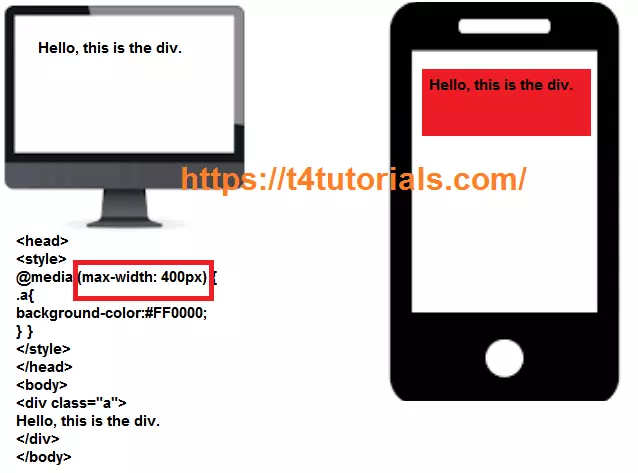
@media (max-width: 400px)
{ .a{ background-color:#FF0000; }
}

@media (min-width: 400px)
{ .a{ background-color:#FF0000; }
}
This Code will apply background color on devices with width at least 400px. It means that this CSS will work on mobile phones, laptops and desktop screen etc.|
1 2 3 4 5 6 7 8 9 10 11 12 13 14 15 |
<html> <head> <style> @media (max-width: 1200px) { .a{ background-color:#FF0000; }} </style> </head> <body> <div class="a"> Hello, this is the div. </div> </body> </html> |
Copy the Code and try it in online Editor
Laptops
Non-Retina Screens, Retina Screens.|
1 2 3 4 5 6 7 8 9 10 11 12 13 |
/* Non-Retina Screens */ @media screen and (min-device-width: 1200px) and (max-device-width: 1600px) and (-webkit-min-device-pixel-ratio: 1) { } /* Retina Screens */ @media screen and (min-device-width: 1200px) and (max-device-width: 1600px) and (-webkit-min-device-pixel-ratio: 2) and (min-resolution: 192dpi) { } |
Windows Phones
Windows Phone, Portrait, and Landscape.|
1 2 3 4 5 6 7 8 9 10 11 12 13 14 15 16 17 18 19 |
/* Windows Phone */ /* Portrait and Landscape */ @media screen and (device-width: 480px) and (device-height: 800px) { } /* Portrait */ @media screen and (device-width: 480px) and (device-height: 800px) and (orientation: portrait) { } /* Landscape */ @media screen and (device-width: 480px) and (device-height: 800px) and (orientation: landscape) { } |
Galaxy
Galaxy S3, Portrait, and Landscape, Galaxy S6.|
1 2 3 4 5 6 7 8 9 10 11 12 13 14 15 16 17 18 19 20 21 22 23 24 25 26 27 28 29 30 31 32 33 34 35 36 37 38 39 40 41 42 43 44 45 46 47 48 49 50 51 52 53 54 55 56 57 58 59 60 61 62 63 64 |
/* Galaxy S3 */ /* Portrait and Landscape */ @media screen and (device-width: 360px) and (device-height: 640px) and (-webkit-device-pixel-ratio: 2) { } /* Portrait */ @media screen and (device-width: 320px) and (device-height: 640px) and (-webkit-device-pixel-ratio: 2) and (orientation: portrait) { } /* Landscape */ @media screen and (device-width: 320px) and (device-height: 640px) and (-webkit-device-pixel-ratio: 2) and (orientation: landscape) { } /* Galaxy S4, S5 and Note 3 */ /* Portrait and Landscape */ @media screen and (device-width: 320px) and (device-height: 640px) and (-webkit-device-pixel-ratio: 3) { } /* Portrait */ @media screen and (device-width: 320px) and (device-height: 640px) and (-webkit-device-pixel-ratio: 3) and (orientation: portrait) { } /* Landscape */ @media screen and (device-width: 320px) and (device-height: 640px) and (-webkit-device-pixel-ratio: 3) and (orientation: landscape) { } /* Galaxy S6 */ /* Portrait and Landscape */ @media screen and (device-width: 360px) and (device-height: 640px) and (-webkit-device-pixel-ratio: 4) { } /* Portrait */ @media screen and (device-width: 360px) and (device-height: 640px) and (-webkit-device-pixel-ratio: 4) and (orientation: portrait) { } /* Landscape */ @media screen and (device-width: 360px) and (device-height: 640px) and (-webkit-device-pixel-ratio: 4) and (orientation: landscape) { } |
HTC Phones
HTC One Portrait and Landscape.|
1 2 3 4 5 6 7 8 9 10 11 12 13 14 15 16 17 18 19 20 21 22 |
/* HTC One */ /* Portrait and Landscape */ @media screen and (device-width: 360px) and (device-height: 640px) and (-webkit-device-pixel-ratio: 3) { } /* Portrait */ @media screen and (device-width: 360px) and (device-height: 640px) and (-webkit-device-pixel-ratio: 3) and (orientation: portrait) { } /* Landscape */ @media screen and (device-width: 360px) and (device-height: 640px) and (-webkit-device-pixel-ratio: 3) and (orientation: landscape) { } |
iPhones
iPhone 4 and 4S, Portrait and Landscape, iPhone 5, 5S, 5C and 5SE, iPhone 6, 6S, 7 and 8.|
1 2 3 4 5 6 7 8 9 10 11 12 13 14 15 16 17 18 19 20 21 22 23 24 25 26 27 28 29 30 31 32 33 34 35 36 37 38 39 40 41 42 43 44 45 46 47 48 49 50 51 52 53 54 55 56 57 58 59 60 61 62 63 64 65 66 67 68 69 70 71 72 73 74 75 76 77 78 79 80 81 82 83 84 85 86 87 88 89 90 91 92 93 94 95 96 97 98 99 100 101 102 103 104 105 106 107 108 109 110 111 112 |
/* iPhone 4 and 4S */ /* Portrait and Landscape */ @media only screen and (min-device-width: 320px) and (max-device-width: 480px) and (-webkit-min-device-pixel-ratio: 2) { } /* Portrait */ @media only screen and (min-device-width: 320px) and (max-device-width: 480px) and (-webkit-min-device-pixel-ratio: 2) and (orientation: portrait) { } /* Landscape */ @media only screen and (min-device-width: 320px) and (max-device-width: 480px) and (-webkit-min-device-pixel-ratio: 2) and (orientation: landscape) { } /* iPhone 5, 5S, 5C and 5SE */ /* Portrait and Landscape */ @media only screen and (min-device-width: 320px) and (max-device-width: 568px) and (-webkit-min-device-pixel-ratio: 2) { } /* Portrait */ @media only screen and (min-device-width: 320px) and (max-device-width: 568px) and (-webkit-min-device-pixel-ratio: 2) and (orientation: portrait) { } /* Landscape */ @media only screen and (min-device-width: 320px) and (max-device-width: 568px) and (-webkit-min-device-pixel-ratio: 2) and (orientation: landscape) { } /* iPhone 6, 6S, 7 and 8 */ /* Portrait and Landscape */ @media only screen and (min-device-width: 375px) and (max-device-width: 667px) and (-webkit-min-device-pixel-ratio: 2) { } /* Portrait */ @media only screen and (min-device-width: 375px) and (max-device-width: 667px) and (-webkit-min-device-pixel-ratio: 2) and (orientation: portrait) { } /* Landscape */ @media only screen and (min-device-width: 375px) and (max-device-width: 667px) and (-webkit-min-device-pixel-ratio: 2) and (orientation: landscape) { } /* iPhone 6+, 7+ and 8+ */ /* Portrait and Landscape */ @media only screen and (min-device-width: 414px) and (max-device-width: 736px) and (-webkit-min-device-pixel-ratio: 3) { } /* Portrait */ @media only screen and (min-device-width: 414px) and (max-device-width: 736px) and (-webkit-min-device-pixel-ratio: 3) and (orientation: portrait) { } /* Landscape */ @media only screen and (min-device-width: 414px) and (max-device-width: 736px) and (-webkit-min-device-pixel-ratio: 3) and (orientation: landscape) { } /* ----------- iPhone X ----------- */ /* Portrait and Landscape */ @media only screen and (min-device-width: 375px) and (max-device-width: 812px) and (-webkit-min-device-pixel-ratio: 3) { } /* Portrait */ @media only screen and (min-device-width: 375px) and (max-device-width: 812px) and (-webkit-min-device-pixel-ratio: 3) and (orientation: portrait) { } /* Landscape */ @media only screen and (min-device-width: 375px) and (max-device-width: 812px) and (-webkit-min-device-pixel-ratio: 3) and (orientation: landscape) { } |
Google Pixel
Google Pixel Portrait and Landscape, Google Pixel XL.|
1 2 3 4 5 6 7 8 9 10 11 12 13 14 15 16 17 18 19 20 21 22 23 24 25 26 27 28 29 30 31 32 33 34 35 36 37 38 39 40 41 42 43 |
/* ----------- Google Pixel ----------- */ /* Portrait and Landscape */ @media screen and (device-width: 360px) and (device-height: 640px) and (-webkit-device-pixel-ratio: 3) { } /* Portrait */ @media screen and (device-width: 360px) and (device-height: 640px) and (-webkit-device-pixel-ratio: 3) and (orientation: portrait) { } /* Landscape */ @media screen and (device-width: 360px) and (device-height: 640px) and (-webkit-device-pixel-ratio: 3) and (orientation: landscape) { } /* Google Pixel XL */ /* Portrait and Landscape */ @media screen and (device-width: 360px) and (device-height: 640px) and (-webkit-device-pixel-ratio: 4) { } /* Portrait */ @media screen and (device-width: 360px) and (device-height: 640px) and (-webkit-device-pixel-ratio: 4) and (orientation: portrait) { } /* Landscape */ @media screen and (device-width: 360px) and (device-height: 640px) and (-webkit-device-pixel-ratio: 4) and (orientation: landscape) { } |
iPads Tablets
iPad 1, 2, Mini and Air, Portrait and Landscape, iPad 3, 4 and Pro 9.7, iPad Pro 10.5.|
1 2 3 4 5 6 7 8 9 10 11 12 13 14 15 16 17 18 19 20 21 22 23 24 25 26 27 28 29 30 31 32 33 34 35 36 37 38 39 40 41 42 43 44 45 46 47 48 49 50 51 52 53 54 55 56 57 58 59 60 61 62 63 64 65 66 67 68 69 70 71 72 73 74 75 76 77 78 79 80 81 82 83 84 85 86 87 88 89 90 91 92 93 |
/* iPad 1, 2, Mini and Air */ /* Portrait and Landscape */ @media only screen and (min-device-width: 768px) and (max-device-width: 1024px) and (-webkit-min-device-pixel-ratio: 1) { } /* Portrait */ @media only screen and (min-device-width: 768px) and (max-device-width: 1024px) and (orientation: portrait) and (-webkit-min-device-pixel-ratio: 1) { } /* Landscape */ @media only screen and (min-device-width: 768px) and (max-device-width: 1024px) and (orientation: landscape) and (-webkit-min-device-pixel-ratio: 1) { } /* iPad 3, 4 and Pro 9.7 */ /* Portrait and Landscape */ @media only screen and (min-device-width: 768px) and (max-device-width: 1024px) and (-webkit-min-device-pixel-ratio: 2) { } /* Portrait */ @media only screen and (min-device-width: 768px) and (max-device-width: 1024px) and (orientation: portrait) and (-webkit-min-device-pixel-ratio: 2) { } /* Landscape */ @media only screen and (min-device-width: 768px) and (max-device-width: 1024px) and (orientation: landscape) and (-webkit-min-device-pixel-ratio: 2) { } /* iPad Pro 10.5 */ /* Portrait and Landscape */ @media only screen and (min-device-width: 834px) and (max-device-width: 1112px) and (-webkit-min-device-pixel-ratio: 2) { } /* Portrait */ /* Declare the same value for min- and max-width to avoid colliding with desktops */ /* Source: https://medium.com/connect-the-dots/css-media-queries-for-ipad-pro-8cad10e17106*/ @media only screen and (min-device-width: 834px) and (max-device-width: 834px) and (orientation: portrait) and (-webkit-min-device-pixel-ratio: 2) { } /* Landscape */ /* Declare the same value for min- and max-width to avoid colliding with desktops */ /* Source: https://medium.com/connect-the-dots/css-media-queries-for-ipad-pro-8cad10e17106*/ @media only screen and (min-device-width: 1112px) and (max-device-width: 1112px) and (orientation: landscape) and (-webkit-min-device-pixel-ratio: 2) { } /* iPad Pro 12.9 */ /* Portrait and Landscape */ @media only screen and (min-device-width: 1024px) and (max-device-width: 1366px) and (-webkit-min-device-pixel-ratio: 2) { } /* Portrait */ /* Declare the same value for min- and max-width to avoid colliding with desktops */ /* Source: https://medium.com/connect-the-dots/css-media-queries-for-ipad-pro-8cad10e17106*/ @media only screen and (min-device-width: 1024px) and (max-device-width: 1024px) and (orientation: portrait) and (-webkit-min-device-pixel-ratio: 2) { } /* Landscape */ /* Declare the same value for min- and max-width to avoid colliding with desktops */ /* Source: https://medium.com/connect-the-dots/css-media-queries-for-ipad-pro-8cad10e17106*/ @media only screen and (min-device-width: 1366px) and (max-device-width: 1366px) and (orientation: landscape) and (-webkit-min-device-pixel-ratio: 2) { } |
Galaxy Tables
Galaxy Tab 2 Portrait and Landscape, Galaxy Tab S.|
1 2 3 4 5 6 7 8 9 10 11 12 13 14 15 16 17 18 19 20 21 22 23 24 25 26 27 28 29 30 31 32 33 34 35 36 37 |
/* Galaxy Tab 2 */ /* Portrait and Landscape */ @media (min-device-width: 800px) and (max-device-width: 1280px) { } /* Portrait */ @media (max-device-width: 800px) and (orientation: portrait) { } /* Landscape */ @media (max-device-width: 1280px) and (orientation: landscape) { } /* Galaxy Tab S */ /* Portrait and Landscape */ @media (min-device-width: 800px) and (max-device-width: 1280px) and (-webkit-min-device-pixel-ratio: 2) { } /* Portrait */ @media (max-device-width: 800px) and (orientation: portrait) and (-webkit-min-device-pixel-ratio: 2) { } /* Landscape */ @media (max-device-width: 1280px) and (orientation: landscape) and (-webkit-min-device-pixel-ratio: 2) { } |
Nexus Tablets
Nexus 7 Portrait and Landscape, Nexus 9.|
1 2 3 4 5 6 7 8 9 10 11 12 13 14 15 16 17 18 19 20 21 22 23 24 25 26 27 28 29 30 31 32 33 34 35 36 37 38 39 40 41 42 43 44 45 46 47 48 49 |
/* Nexus 7 */ /* Portrait and Landscape */ @media screen and (device-width: 601px) and (device-height: 906px) and (-webkit-min-device-pixel-ratio: 1.331) and (-webkit-max-device-pixel-ratio: 1.332) { } /* Portrait */ @media screen and (device-width: 601px) and (device-height: 906px) and (-webkit-min-device-pixel-ratio: 1.331) and (-webkit-max-device-pixel-ratio: 1.332) and (orientation: portrait) { } /* Landscape */ @media screen and (device-width: 601px) and (device-height: 906px) and (-webkit-min-device-pixel-ratio: 1.331) and (-webkit-max-device-pixel-ratio: 1.332) and (orientation: landscape) { } /* Nexus 9 */ /* Portrait and Landscape */ @media screen and (device-width: 1536px) and (device-height: 2048px) and (-webkit-min-device-pixel-ratio: 1.331) and (-webkit-max-device-pixel-ratio: 1.332) { } /* Portrait */ @media screen and (device-width: 1536px) and (device-height: 2048px) and (-webkit-min-device-pixel-ratio: 1.331) and (-webkit-max-device-pixel-ratio: 1.332) and (orientation: portrait) { } /* Landscape */ @media screen and (device-width: 1536px) and (device-height: 2048px) and (-webkit-min-device-pixel-ratio: 1.331) and (-webkit-max-device-pixel-ratio: 1.332) and (orientation: landscape) { } |